CASE STUDY

Sedex

Sedex provides sustainable business and supply chain solutions

At Sedex, I contributed to Sedex’s rebrand, focusing on the UI Design elements and designed the Sedex annual flagship conference app.

Three phones displaying concert images next to geometric shapes on a light green surface.

01

The rebrand

The rebrand

In the brand refresh, changes included improving colour codes and logo touch up, prioritising sans-serif over serif font; and introducing beauty pages with stock pictures with abstract illustrations and product mockups. The improvements aimed to make the brand look sleeker, energetic and professional.
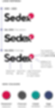
Abstract graphic with red, teal, gray, and purple circles on a black background.

02

Iconography research

Iconography research

App screenshots showing text, icons, and menu options; English, Français, and more global languages.

03

Icon development

Icon development

Hand breakdown and columns settings with design elements and icons on purple background.

04

UI elements

UI elements

Various phone and tablet screens with content, likely a website design example.

05

Publishing

Publishing

Strategic report Sedex, people group around table, text and visuals of network.
Several iPhone screens displaying app interfaces, including Sedex, on a white background.
Photo of deisy rojas

Deisy Rojas

Design systems fanatic. I build cool things and solve hard problems

© 2026 Deisy Rojas. All rights reserved.

Photo of deisy rojas

Deisy Rojas

Design systems fanatic. I build cool things and solve hard problems

© 2026 Deisy Rojas. All rights reserved.

Photo of deisy rojas

Deisy Rojas

Design systems fanatic. I build cool things and solve hard problems

© 2026 Deisy Rojas. All rights reserved.